
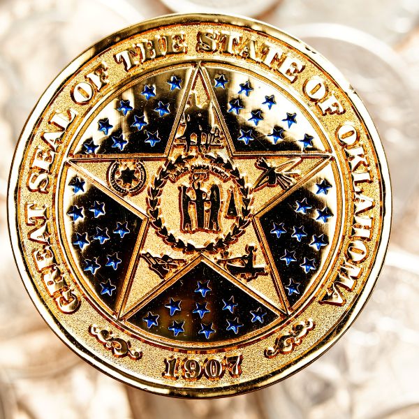
Most challenge coin guides tell you to “choose a theme” and “keep it simple.” That advice is correct but useless. What actually determines whether a coin looks sharp or muddy is a series of technical decisions: size, 2D vs 3D, metal, plating, enamel type, and edge. Get those right, and the design works. Get them wrong, and no amount of “storytelling” saves it.
This guide walks through each decision the way a coin designer actually makes them.
Step 1: Pick the Size Before You Design Anything
The standard pocket challenge coin is 1.75 inches in diameter. This is the size most people order and the size that fits comfortably in a pocket or display case.
Go to 2 inches only if your design carries a lot of fine text or a detailed crest that needs room to read. At 2.5 inches and above, you are no longer making a pocket coin—you are making a presentation medallion for awards or retirement gifts.
The practical rule: design at 1.75 inches first. If the text is too small to read at arm‘s length on a 1.75-inch proof, either cut text or go to 2 inches. Do not go to 2.5 inches to “fit everything.” A busy 2.5-inch coin looks worse than a clean 1.75-inch one.
Step 2: Decide 2D or 3D (This Determines Everything Else)
This is the most consequential choice in the entire process, and most guides gloss over it.
2D coins are die-struck with flat levels: raised metal lines and recessed fields that can take enamel color. The edges stay crisp. This is the right choice for seals, crests, badges, flags, and text meant to look like a struck medal.
3D coins use a sculpted mold with real contours and depth. This is the right choice for faces, animals, eagles, mascots, buildings, and vehicles—subjects that should look modeled rather than stamped.
Here is what most people miss: 3D relief is usually plated metal, not enamel-filled. The depth comes from the sculpted contours catching shadow, often with an antique finish. Enamel stays on the flat areas. If you want a fully colored 3D coin, you need a different (and more expensive) production process.
A common hybrid approach: 3D sculpted emblem on the front, flat 2D color-filled design on the back. This gives you the visual impact of 3D without paying for two 3D molds.
Also important: round 2D coins are typically struck from brass. 3D coins and custom-shaped coins are typically cast in zinc alloy. The material follows the process, not the other way around.

Source:https://www.challengecoinsltd.com/surfs-up-with-hawaiian-themed-military-challenge-coins
Step 3: Choose the Shape (With a Cost Reality Check)
Round coins are the majority of orders, and they are the cheapest per unit. Custom outlines—shields, badges, state silhouettes, unit patches, aircraft profiles—cost the same as a round coin of the same diameter as long as the outline has no fully enclosed interior cut-out.
Interior cut-outs (holes through the coin) require extra tooling and cost more. If you are considering a bottle-opener coin, an opener worked into the outer edge adds no extra cost; a hole-and-tooth cut through the middle requires extra tooling.
Source:https://www.challengecoins4less.com/faq/what-is-the-most-popular-size-coin
Step 4: Pick Plating and Enamel Together
These are not separate decisions. The plating determines whether your enamel colors look vibrant or dead.
Plating options that work:
- Antique gold / antique silver / antique brass: Darkened recesses add depth and make small text readable. The default choice for military and first-responder coins.
- Bright gold / bright nickel: Cleaner, more modern. Common in corporate settings.
- Black nickel: Bold contrast, works well with bright enamel.
Enamel: hard vs soft. Hard enamel is polished flat to the metal surface. It is smoother, more premium-feeling, and resists wear better over time. Soft enamel leaves a slightly recessed, textured feel and costs less for small runs. If the coin will be carried daily or used outdoors, pay for hard enamel.
The contrast rule: gold plating with yellow enamel disappears. Silver plating with light gray enamel does the same. Always check a digital proof with the actual final plating + color combination before approving.
Step 5: Set Text and Line Weights Correctly
This is where first-time designs fail most often.
The minimum readable text height on a challenge coin is roughly 1.5mm. Anything smaller will fill in or become illegible after stamping and plating. If you need to include a motto, a date, and a name, count the characters. At 1.5mm height, you can fit approximately 20–25 characters around a 1.75-inch coin’s circumference comfortably.
The same applies to line weight. A thin line that looks elegant on a screen can disappear entirely in metal. Ask your designer: “Will this line survive stamping at this size?” A good designer will thicken it before the die is cut, not after.
Step 6: Choose the Edge (The Detail People Feel)
The edge is the part of the coin people touch before they see. A smooth edge is standard and included. Upgraded edges add a tactile signature:
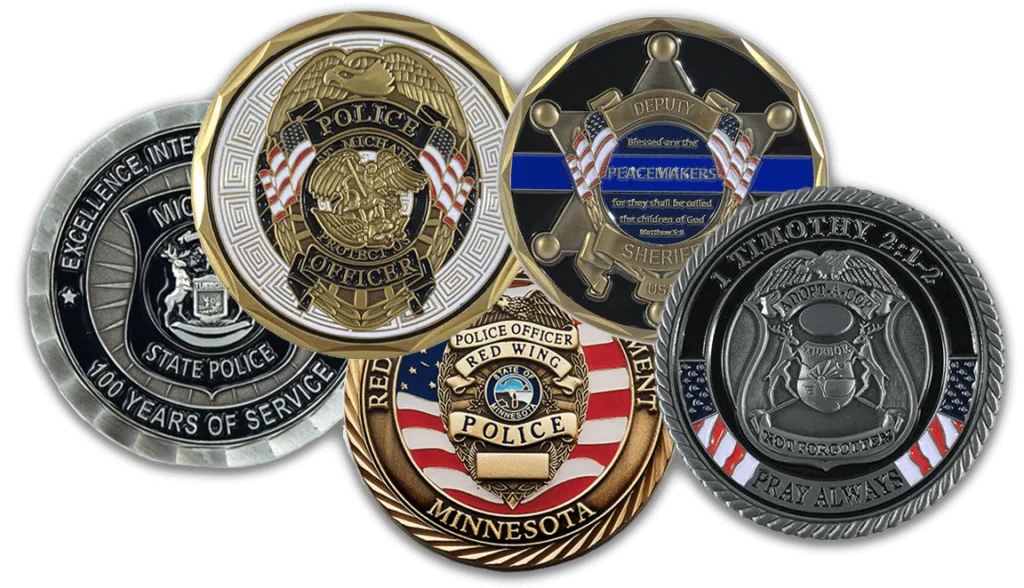
- Reeded (spur) edge: traditional, formal, associated with military and law enforcement
- Rope edge: nautical or heritage feel
- Text edge: engrave a motto, date, or unit name around the rim
Most custom edges carry a small upcharge. They are worth it only if the coin is meant to be handled and noticed—which, for a challenge coin, it usually is.
https://customcalibers.com/products/solid-brass-challenge-coin
Step 7: Review the Proof Like a Professional
Manufacturers provide a free digital proof before production. Most people glance at it and approve. Do not do that.
Check these specifically:
- Read the smallest text at arm‘s length on your phone screen. If you cannot read it without zooming, it will not read in metal.
- Confirm the plating + enamel combination. Ask for the proof to show the actual metal color, not a flat digital approximation.
- Check the edge style and any engraving. Text edges are easy to forget on a proof.
- Ask about line weight. If any line looks thin, ask: “Will this hold up in production?”
- If ordering over 100 coins, request a physical pre-production sample. A photo of a rendering can hide flaws that are obvious in metal.
Best Practices for Designing Challenge Coins
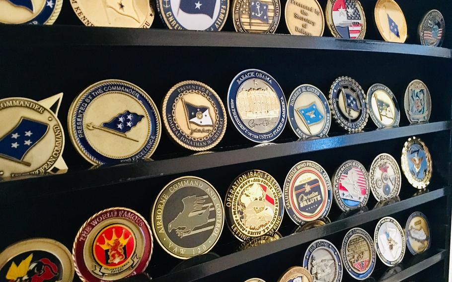
The Three Mistakes That Ruin Coin Designs
Too much text. A coin is not a plaque. A name, a date, and a short motto (3–5 words) is the practical maximum. Anything more and the text becomes too small to read.
Low-contrast plating + enamel. Gold on yellow. Silver on gray. Black nickel on dark blue. These combinations look fine on a screen and fail in metal.
Skipping the physical proof on large orders. Digital proofs do not show how plating reflects light, how enamel sits in recesses, or how the edge feels in hand. For any order over 100 units, a physical sample is not optional.
Conclusion
Designing custom challenge coins is a creative and rewarding process that results in unique and meaningful tokens. By following these tips and best practices, you can create a design that captures the essence of your purpose and theme, and produces a high-quality coin that will be cherished for years to come.
Ready to bring your vision to life? At BlythePin, we don’t just make coins—we craft stories. With our top-notch materials, expert craftsmanship, and personalized service, your custom challenge coins will be a cut above the rest. Start your design journey with us today and see how easy it is to create something truly unforgettable.